San Diego Heat Risk Explorer User Guide
A primer on variables, methods, and map interpretation.
The Heat Risk Explorer is an interactive heat-risk map of San Diego County, computed at the census-tract level. To use the Heat Risk Explorer, users select variables from the available options (such as heat exposure, demographics, health conditions, air conditioning access, green space proximity, income, and others.) Once selected, the tool returns a composite Heat Risk Index and the dominant driver for each census tract.
Open the map →Quick Start
To get started, click Open the Map above.
- Default variables are already selected — click Build Composite Risk Map.
- Click any census tract to see its Heat Risk Index and dominant driver.
- Under Map Layer, switch to Dominant Driver to see what drives risk for each census tract.
- Or use the left sidebar to customize the map — toggle individual variables on or off before re-building.
Heat Risk Index Data Inputs
The Heat Risk Index is built from three core pillars: heat exposure (the physical heat experienced in a given census tract), population sensitivity (who lives there and the factors that make their communities more susceptible to heat), and adaptive capacity (systems and infrastructure that affect the ability of residents to cope with heat stress). Multiple variables (listed below) from each pillar can be selected by the user to be included.
Heat Exposure
Heat
Mean Daily Maximum Temperature; 85th and 99th Percentile Daily Maximum Temperature (the hottest 15% and 1% of days); Annual Maximum Temperature; Landsat-derived Mean Land Surface Temperature; and 85th and 99th Percentile Wet-Bulb Globe Temperature (WBGT), which combines temperature, humidity, sun, and wind into a single heat-safety index.
Nighttime Heat
Mean Overnight Minimum Temperature; 90th Percentile Overnight Minimum Temperature (warm nights); and No-Relief Night Fraction (the percent of nights without cooling relief). Warm nights are associated with elevated heat-illness risk, especially in older adults.
Humidity
Mean Relative Humidity; Mean Humidity During Hot Hours (hours when air temperature exceeds the tract's 95th-percentile hourly temperature); and 95th Percentile Dewpoint Temperature. High humidity reduces evaporative cooling and raises apparent temperature.
Population Sensitivity
Health
High Blood Pressure, Current Asthma, Coronary Heart Disease, COPD, Diabetes, Stroke, Depression, Cognitive Difficulty, and tract-level Life Expectancy percentile. Chronic-disease prevalence is from CDC PLACES; Life Expectancy is from the Healthy Places Index.
Demographics
Age 17 & Under, Age 65+, Disability, Limited English, Single-Parent HH, Below 150% Poverty, Unemployed, Housing Cost Burden, No HS Diploma, Uninsured, Minority, Multi-Unit Structures, Mobile Homes, Crowding, No Vehicle, Group Quarters, and No Internet.
Social Vulnerability Index (SVI)
Pre-built SVI summary themes: Overall SVI, Socioeconomic Status, HH Disability/Language, Racial/Ethnic Minority, and Housing/Transportation. Source: CDC Social Vulnerability Index (SVI) 2022.
Environment
Pollution (Inverse), Ozone, PM 2.5, and Diesel PM exposure. Source: Healthy Places Index.
Higher population sensitivity raises the Heat Risk Index.
Adaptive Capacity
Air Conditioning
AC Prevalence (the percent of homes with any AC) from two independent sources: the U.S. Census Bureau's Local Air Conditioning Estimates (LACE) 2023, the first official tract-level AC estimates from the Census Bureau, and Romitti et al. (2022), a published modeled estimate retained for comparison.
Built Environment
Tree Canopy, Park Access, Green Space (%), Renter-Occupied (%), and housing age (Pre-1980 and Pre-1960 Housing share). Sources: Healthy Places Index, ACS B25034, and SanGIS.
Socioeconomic
Income, Above Poverty, Economic, Education, Housing Quality, Healthcare Access, Transportation, Social Cohesion, Neighborhood Quality, Health Insurance, Automobile Access, Homeownership, Commute Time, Supermarket Access, Voter Participation, and Retail Food Access. Source: Healthy Places Index.
Higher adaptive capacity lowers the Heat Risk Index.
How the components combine
Each pillar score ranks a census tract relative to others in San Diego County. The ranking reflects a weighted combination of the variables within that pillar. The Heat Risk Index is the mean of the three pillar scores (Heat Exposure, Population Sensitivity, and Adaptive Capacity), producing a single value between 0–100 per census tract.
Correlated variables are not double-counted. Lower-income tracts tend to have older housing, less tree cover, and higher chronic-illness rates. A direct sum would weight that shared pattern multiple times. The tool uses Principal Component Analysis, a statistical method that identifies the dominant underlying patterns in a set of correlated variables, so each shared pattern is counted once rather than multiple times.
Adaptive-capacity variables enter the score with the opposite sign. A census tract with strong protective resources receives a lower Heat Risk Index even when its exposure is high.
Reading the map
Color
A darker color indicates a higher risk based on the composite Heat Risk Index. The composite map uses red (highest = darkest red). Single-pillar views use the pillar's color: red for Heat Exposure, purple for Population Sensitivity, green for Adaptive Capacity.
Index interpretation
The Heat Risk Index is a relative percentile, not absolute risk. A Heat Risk Index of 75 means the census tract is at higher risk than 75% of San Diego County census tracts. It does not mean 75% of residents will be harmed.
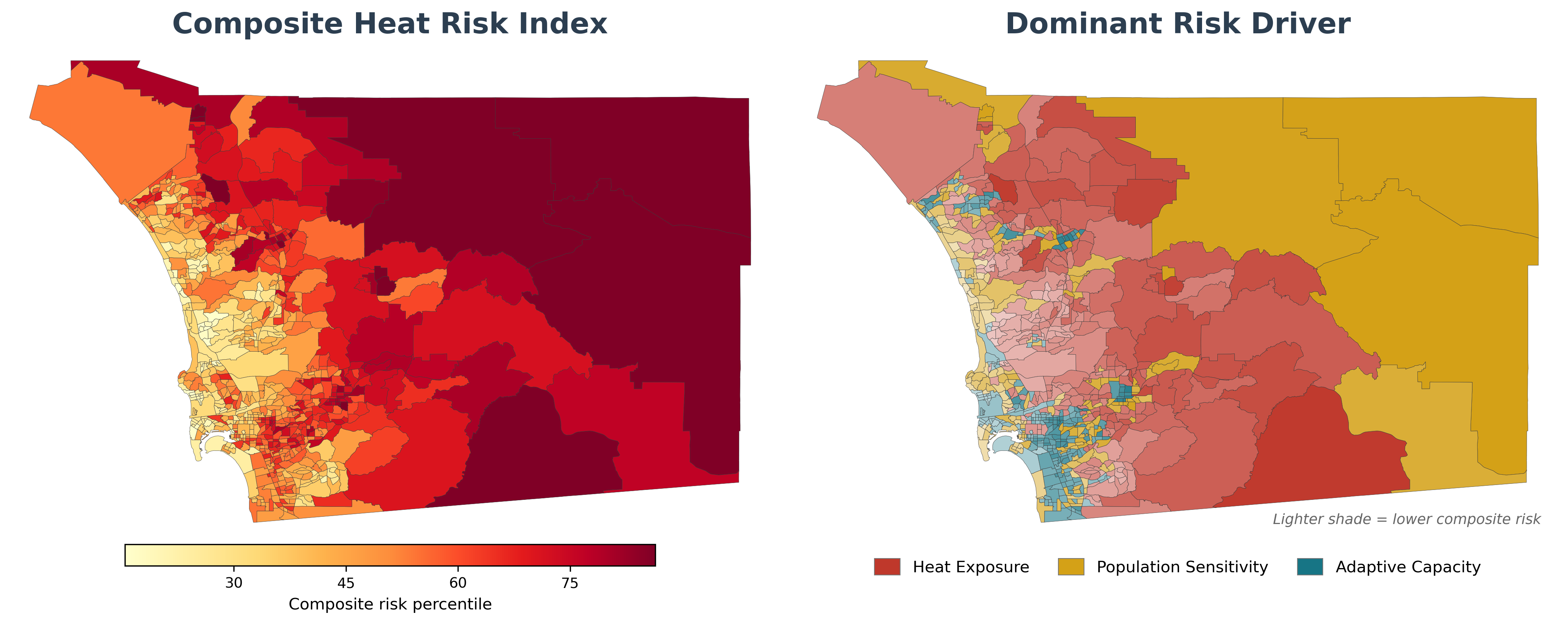
Map layers
- Composite Risk (left panel): the 0–100 Heat Risk Index combining all three pillars (default view).
- Dominant Driver (right panel): census tracts are colored by which pillar contributes most to the Heat Risk Index. This distinguishes hotspots driven by Heat Exposure from those driven by Population Sensitivity or low Adaptive Capacity. Click on a census tract to see the scores for each of the three pillars.
- Primary Spatial Patterns: this drop-down menu lists the independent patterns identified by Principal Component Analysis across all selected variables. Each entry is labeled Pattern N (var X%), where N is the pattern's rank by importance and X% is the share of variance in the data that this pattern explains. Hover over the blue information icons to see which variables contribute most to each pattern.
Census tract panel
Click a census tract for its three pillar scores, its Heat Risk Index, its dominant driver, and to compare it directly against other census tracts.
Sidebar panel
The left sidebar lets you customize the map. Sections, from top to bottom:
- Heat Exposure / Population Sensitivity / Adaptive Capacity: the three pillar groups described above. Use a pillar's header checkbox to toggle the whole pillar; expand each collapsible category (Heat, Nighttime Heat, Health, Demographics, etc.) to toggle individual variables.
- Build Composite Risk Map: combines the variables you selected into a Heat Risk Index for every census tract.
- Map Layer: switch between the Composite Risk, Dominant Driver, a single pillar score, a single raw variable, or one of the Primary Spatial Patterns.
- Jurisdictions: overlay city or tribal-land boundaries on the map.
- Climate Scenario: change the temperature variables to projected mid- (2050) or end-of-century (2080) values under different emissions pathways. See below.
- Accessibility: switch to colorblind-friendly palettes.
- Export: save the current map as a PDF, or download the underlying census-tract-level data.
Future scenarios
Three buttons at the top of the Climate Scenario panel switch the temperature variables between time periods:
- Present Day: observed weather-station data.
- 2050: mid-century mean (2035–2064) from LOCA2-downscaled CMIP6 projections.
- 2080: end-of-century mean (2065–2094) from LOCA2-downscaled CMIP6 projections.
Selecting 2050 or 2080 expands an emissions-pathway selector with three Shared Socioeconomic Pathways (SSPs; see Carbon Brief explainer):
- Moderate Emissions (SSP 2-4.5): emissions decline but not aggressively.
- High Emissions (SSP 3-7.0): emissions remain high.
- Very High Emissions (SSP 5-8.5): unchecked fossil-fuel use.
Compare Scenarios Side-by-Side (button below the emissions-pathway selector) opens a paired view: the Heat Risk Index map under one scenario on the left, and the change in Heat Exposure pillar rank between two chosen scenarios on the right (B minus A, in percentile points on the 0–100 pillar scale — not degrees of warming). The two scenarios on either side can be set independently.
Why percentile rank instead of degrees? Across San Diego County, LOCA2 projects roughly similar absolute warming for every tract (typically ~1–3 °C between scenarios). A Δ°C map would therefore look nearly uniform. The percentile-rank view amplifies the spatial signal that matters for planning: which tracts climb the relative heat-risk ladder fastest. To anchor the rank shift in physical units, hover over any tract on the right map — the tooltip shows that tract's underlying LOCA2 Δ mean Tmax and Δ mean Tmin in °C.
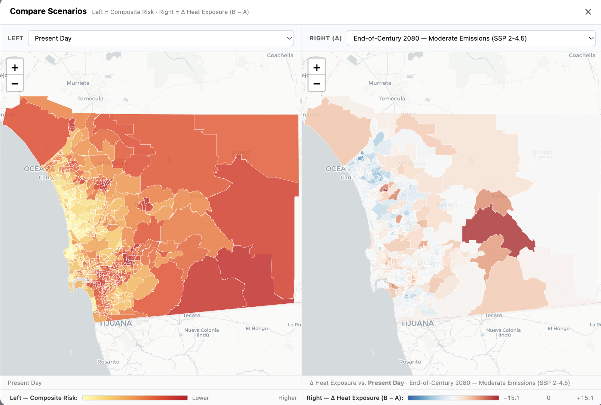
Population Sensitivity and Adaptive Capacity variables are held at present-day values. Reliable long-range projections for demographic, health, and infrastructure conditions don't yet exist at the census-tract level, so the tool does not project future changes to these variables.
Examples
Each example narrows one pillar to a single question, then leaves the other two pillars alone (all variables remain on by default) so the Heat Risk Index still reflects who is hot, who is vulnerable, and who can cope.
Example 1: Where are children most at risk due to heat stress?
- Click the Population Sensitivity header checkbox to clear that pillar, then re-check only Age 17 & Under (under Demographics).
- Select all variables for Heat Exposure and Adaptive Capacity.
- Click Build Composite Risk Map.
- The Population Sensitivity score is now driven entirely by the population 17 and under. Census tracts that are high risk (darker) and driven primarily by Population Sensitivity are places where children are most at risk due to heat stress.
Example 2: Where would people benefit most from subsidies to purchase AC units?
- Click the Adaptive Capacity header checkbox to clear that pillar, then re-check only AC Prevalence (under Air Conditioning).
- Select all variables for Heat Exposure and Population Sensitivity.
- Click Build Composite Risk Map.
- The Adaptive Capacity score is now a pure ranking of how AC-poor each census tract is. The darkest red census tracts are priority areas for an AC-subsidy program: hot, sensitive, and currently lacking AC.
Example 3: Where is nighttime heat most dangerous?
- Click the Heat Exposure header checkbox to clear that pillar, then re-check the Nighttime Heat variables: Mean Overnight Minimum Temperature, 90th Percentile Overnight Minimum Temperature, and No-Relief Night Fraction.
- Leave Population Sensitivity and Adaptive Capacity alone.
- Click Build Composite Risk Map.
- The Heat Exposure score is now a pure ranking of how warm a census tract's nights are. The darkest red census tracts have severe overnight heat alongside vulnerable populations and limited capacity to cool down.
Feedback & bug reports
To report a bug or request a feature, open an issue here.
Data sources
| Variable | Source |
|---|---|
| Heat exposure | |
| Air temperature (daytime & overnight) | MesoWest / Synoptic Data |
| Humid heat (Wet-Bulb Globe Temperature) | NOAA HRRR |
| Land surface temperature | USGS Landsat |
| Future temperature projections | LOCA2 downscaled CMIP6 |
| Population sensitivity | |
| Chronic disease & social needs | CDC PLACES |
| Social vulnerability | CDC SVI 2022 |
| Heat-related hospitalizations | CalHeatScore (CalEPA / OEHHA) |
| Energy burden | DOE LEAD Tool (2022) |
| Demographics, housing & occupation | ACS 5-year estimates |
| Adaptive capacity | |
| Income, education, healthcare, parks & tree canopy | Healthy Places Index (HPI) |
| Air conditioning prevalence | U.S. Census LACE 2023; Romitti et al. (modeled) |
| Impervious surface | NLCD (MRLC) |
| Green space & land use | SANDAG / SanGIS |
| Reference map layers | |
| Population density | EPA EnviroAtlas |
| Cool-zone cooling sites | San Diego County Cool Zones |
Each variable name in the tool has a small (Source) link that opens the original source.
© 2026 Southern California Extreme Heat Research Hub & San Diego Regional Climate Collaborative. Code licensed MIT; data & content CC BY 4.0, with each source under its own terms.